It can be difficult to find the perfect balance when it comes to white spaces – warm enough without being too cream, but cool enough without going too airy. Scandinavian white is one of the most popular trends in home design at the moment, and I have to honestly say: I hate it. There’s something about Scandinavian spaces that always feels like there’s no depth, like someone has simply shoved in some basic pieces and left them there. Today I’m sharing some of the white spaces I do enjoy; grounded, bright, and sophisticated.
Read More »
Tag: colour
Navy Blue Room Inspiration
In a completely un-shocking confession: I don’t like colour in interiors. I’m definitely a minimalist when it comes to my colour schemes, and usually any colour other than a neutral seems too jarring and bright to me. It can be troublesome to work in any colours other than black, white, and grey, but I’ve found that adding deeper colours and accents can be tolerable. I wanted to add colour to my living room and navy seemed like the perfect solution, so I put together some inspiration to encourage me away from my neutrals!
Read More »
30 Spaces Featuring Beautiful Black
Black is one of the most popular colours to use in home design. It’s almost considered a neutral; you can dress it up with accent colours, soften it with tone-on-tone shades, or go for a stark contrast with white. You can keep it soft with a matte coat, make it shine with lacquer, use it all over the room, or keep it to one stand out piece: and I’ve found a whole lot of spaces that harness the magic of black!
Read More »
25 Reasons to Use Bold Colour in Your Home
Bold colour is not something that I regularly invest my time in. I am definitely more of a neutral person, and I like my interiors to have a crisp and tailored feel. But I can’t deny that a statement colour choice just works somehow. It adds a pop of life and excitement to a space. Whether you go all out, or stick to accessories, here’s 25 reasons (in image form!) to inspire you to use a daring colour in your own home.
Read More »
Why Gray is the Best Neutral Color Ever
If there’s one color that is completely underrated in everything, it’s gray. Although gray has experienced a rise in popularity over the past year, a lot of people are still hesitant in using it in their homes. Why? Because it has a reputation of being dark and dull and boring. But in actual fact, it’s the most easily used neutral color on the planet. Gray goes well with literally every other color. And its shades range from barely-there to completely saturated, blue-gray, green-gray, ‘greige’ – the options are endless.
There’s a reason why it’s my ultimate favorite color, and I’ve collected some inspiration that will hopefully prove to you just why you should be thinking about investing in gray.
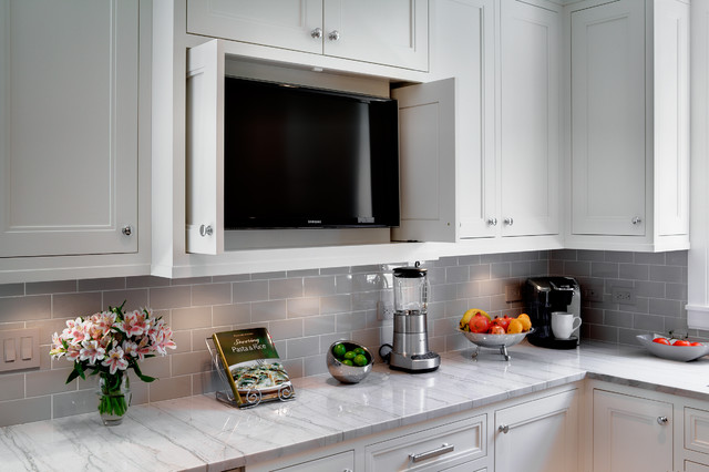
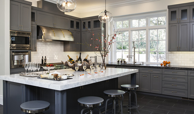
Use gray in your kitchen
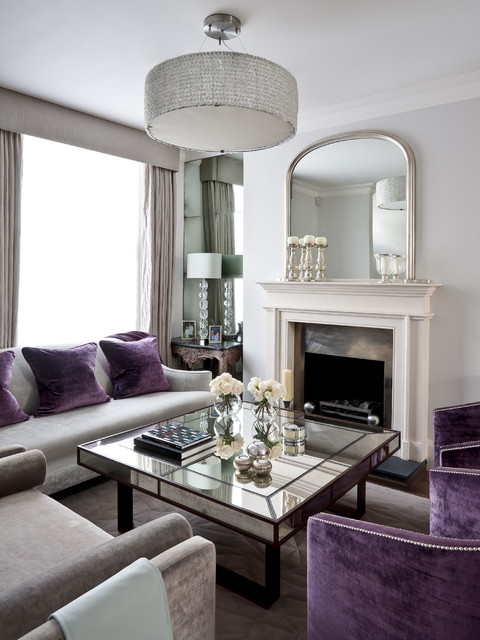
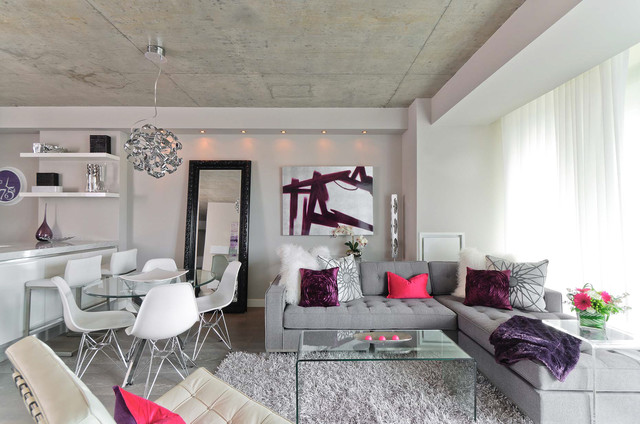
Use it in your living room
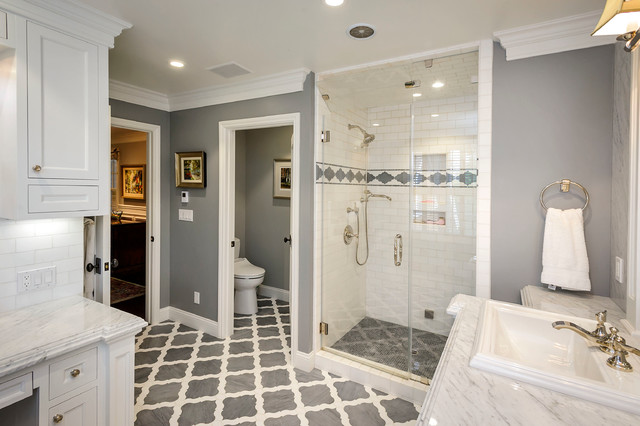
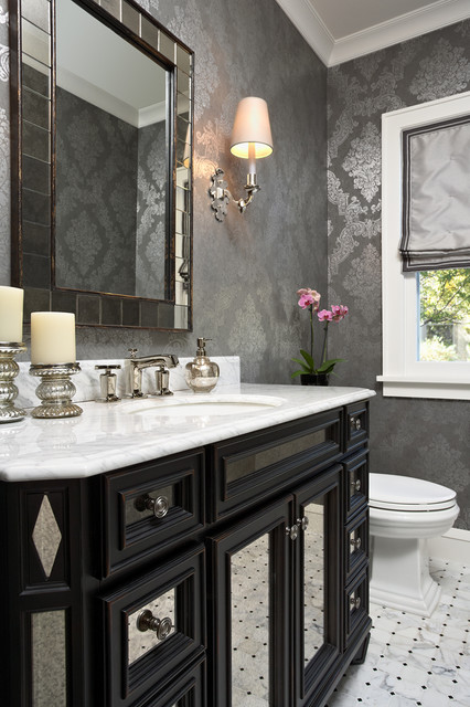
Use it in your bathroom
With a little bit of glitz!
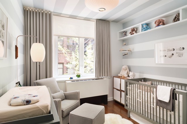
Use it in a nursery
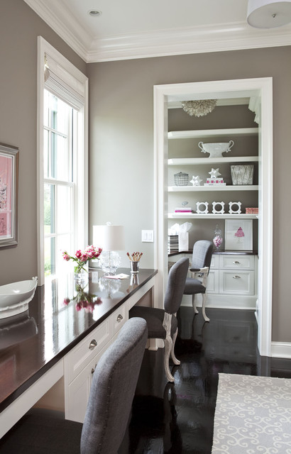
Or a weeny office space
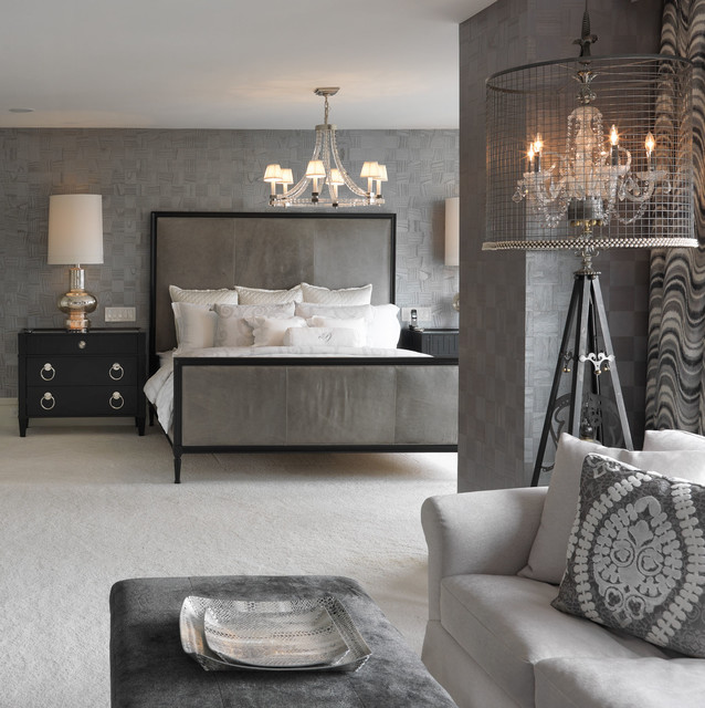
Cover a whole room in it
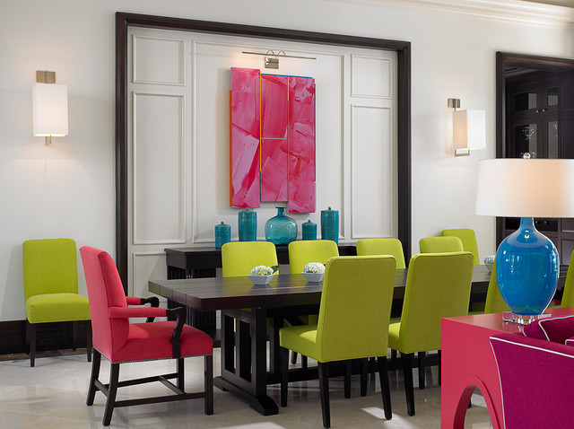
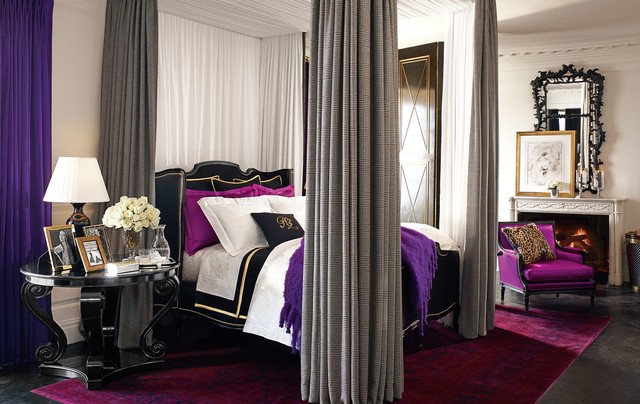
Or use it to ground a bright/contrasting room
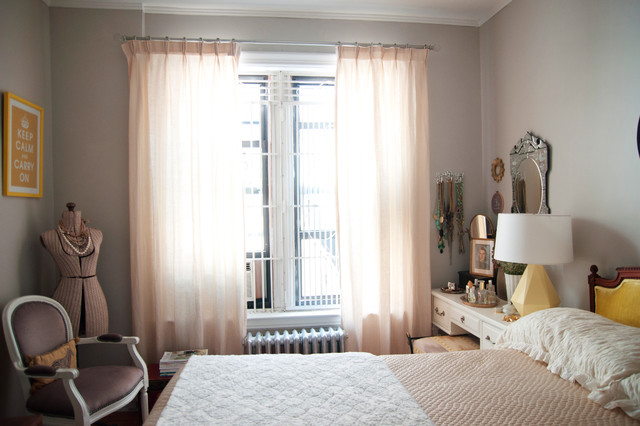
Use it in a soft, light bedroom
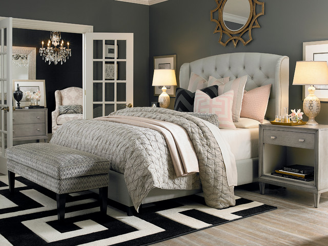
Or use it in a dark, comforting space
Wherever you decide to use gray in your home, remember that you can always change up the accent colors to quickly refresh and revive your look! Get excited about gray, because I am.
Love, Vanessa.
Feature image is painted in Benjamin Moore’s Ozark Shadows.